Art Direction, Catalogue, Design
Creative Director: Brock Ellis
Photographer: Brenndan Laird
Producer: Laura Pan
Location: Vancouver, BC
Art-directed flay lay images for tentree’s seasonal catalogue to showcase new items to sales reps in a fun and eye-catching way.
Artwork, Large Format Print
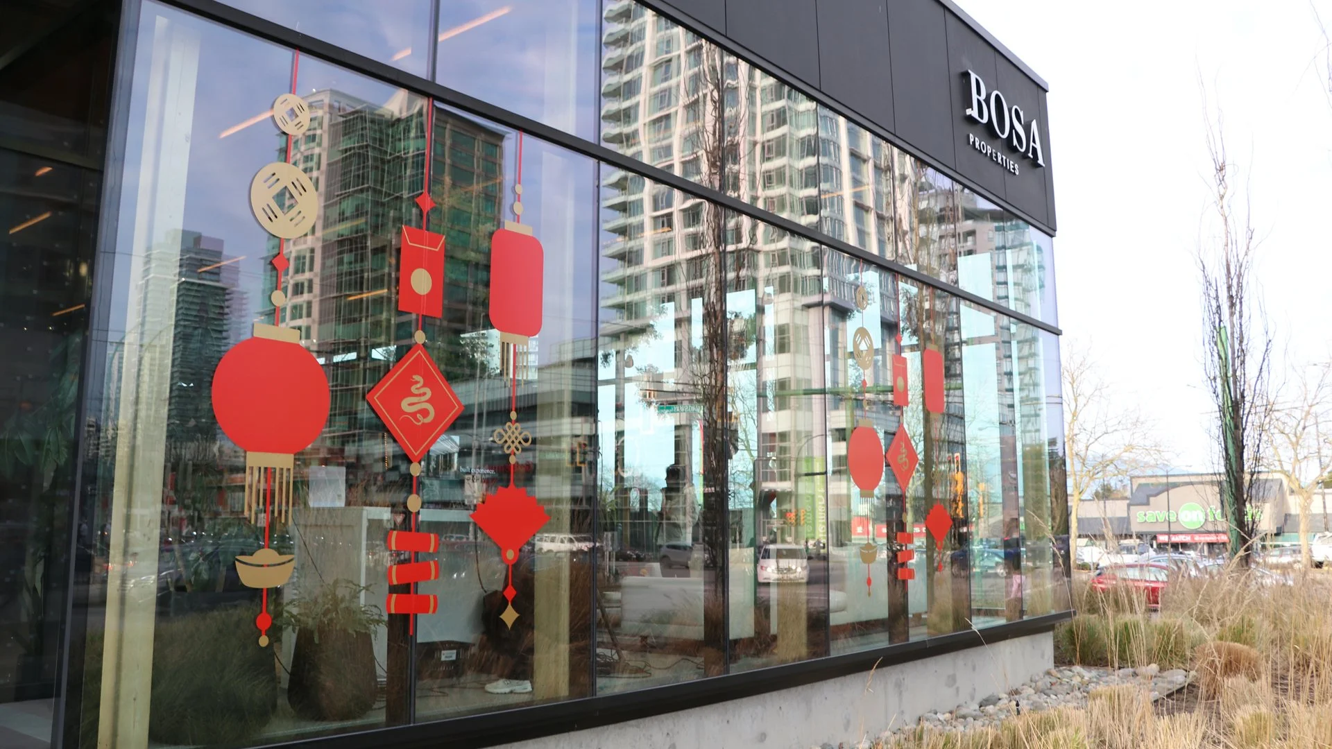
Client: BOSA Properties
Location: Burnaby and Surrey, BC
About: Real estate developers, Bosa Properties, celebrated Lunar New Year at two of its sales centre locations in the Greater Vancouver area.
The Project: Design window and Lucky Wall graphics following Bosa’s brand guidelines.
Sketches
Artwork, Print, Lettering
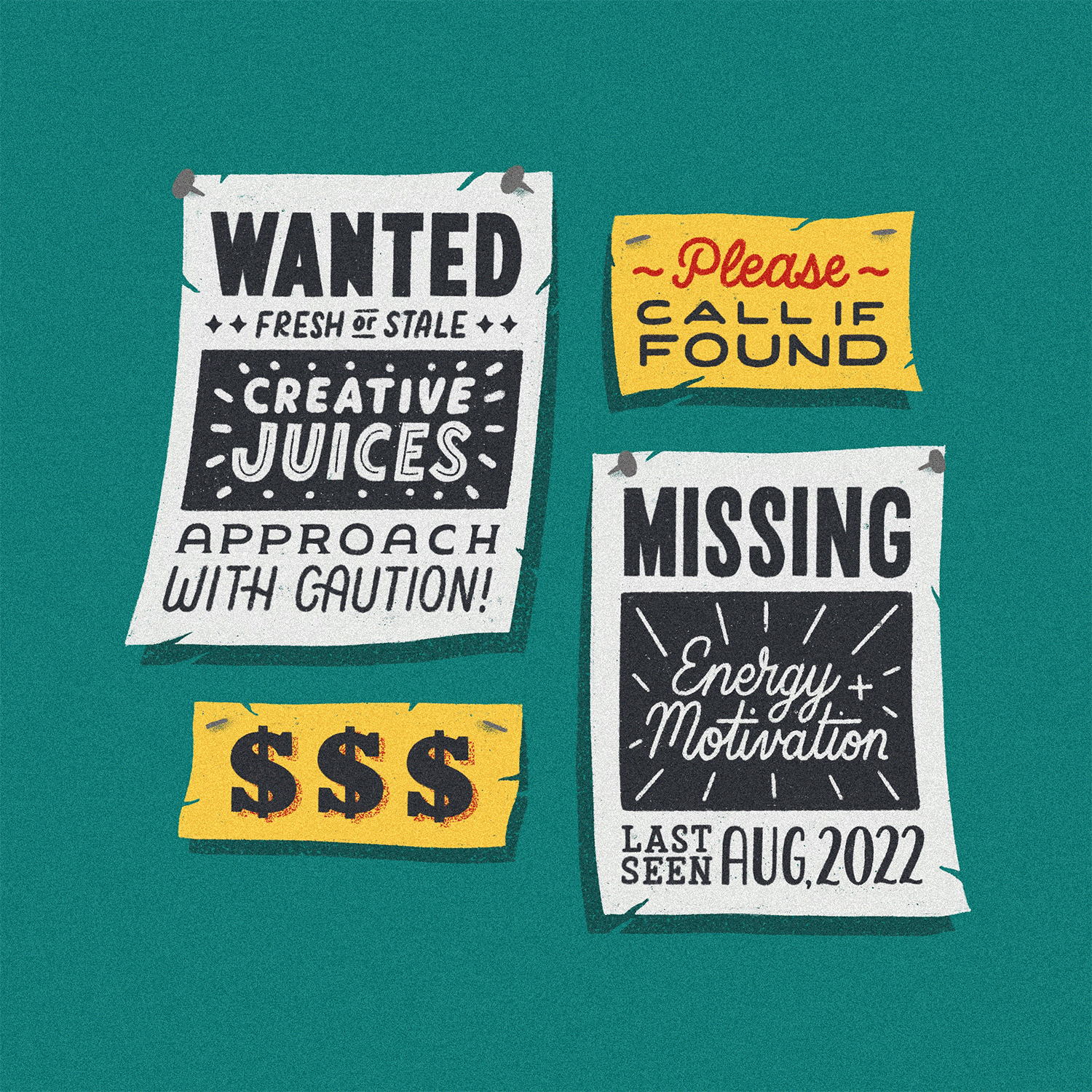
Client: SAD Magazine
Location: Vancouver, BC
About: SAD Magazine is an independent publication dedicated to covering the stories, art and design of Vancouver from the perspective of local, emerging creatives.
The Project: Letter a page of the word “time” as a visual break within the issue. I decided to do this flash sheet-style collection of the word in different type styles, textures, shadows, etc. taking the reader for a funky visual ride (through time perhaps?). This piece was chosen to be the back cover after final delivery.
Artwork
Client: Got Craft Market
Photos provided by: Got Craft Market
Location: Vancouver, BC
About: A series of local markets that support makers and small shops with opportunities to showcase and sell their work. Through their markets, they provide an inclusive space to discover, inspire, and connect with the community.
The Project: Design the tote bag artwork for their 2022 holiday market and 2023 spring market.
Artwork
Creative Director: Jen Cook
Photos provided by: Lizzie Titchard
Location: Vancouver, BC
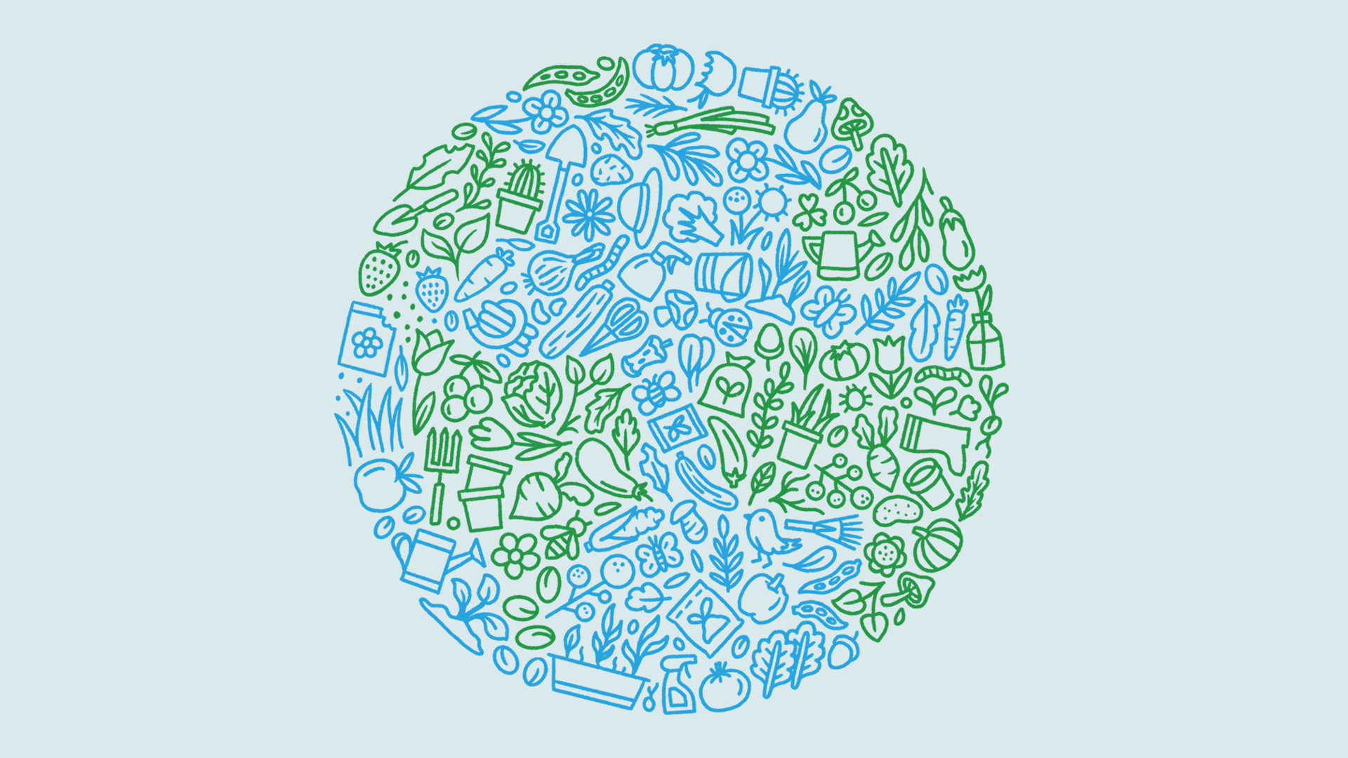
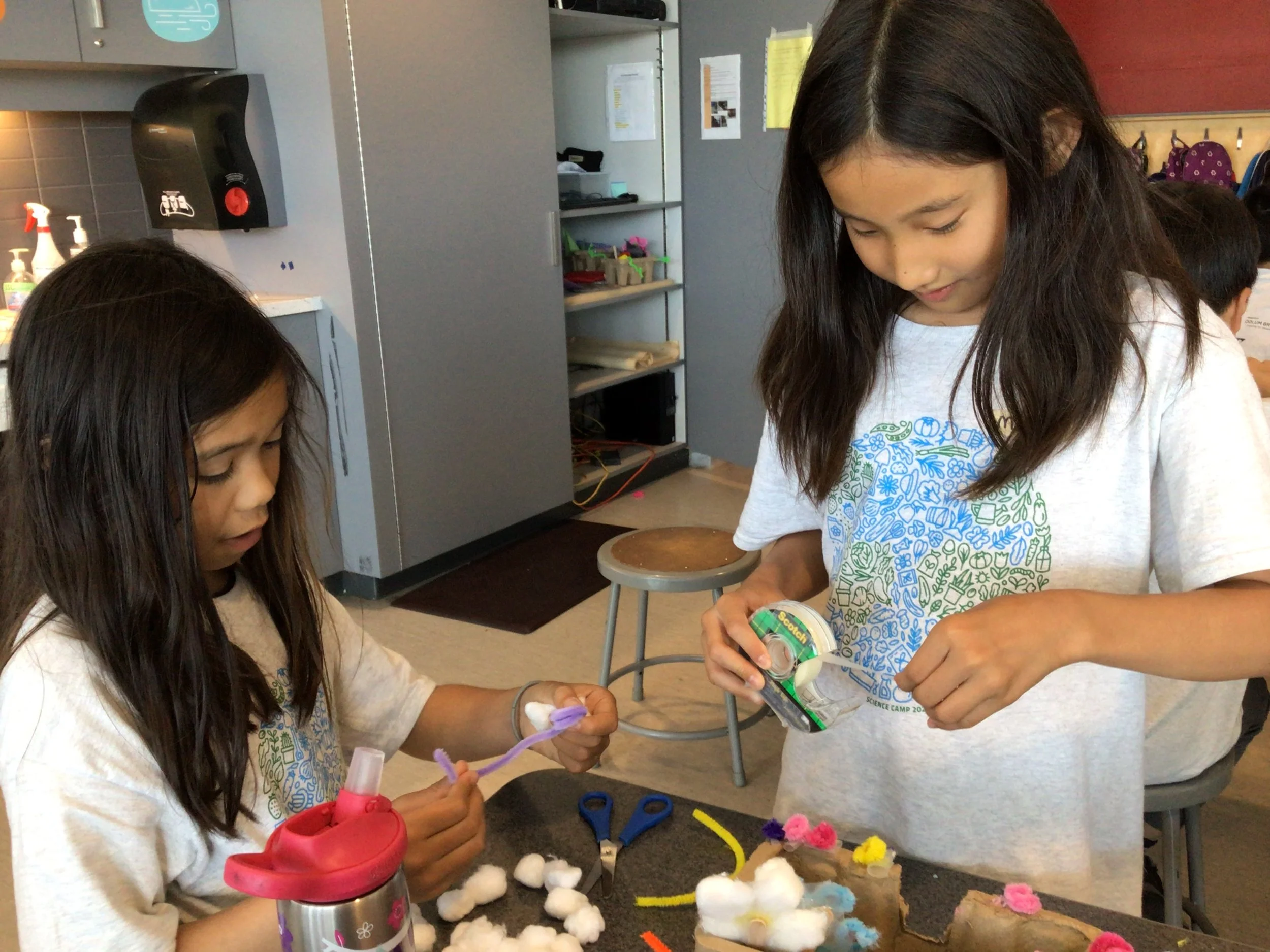
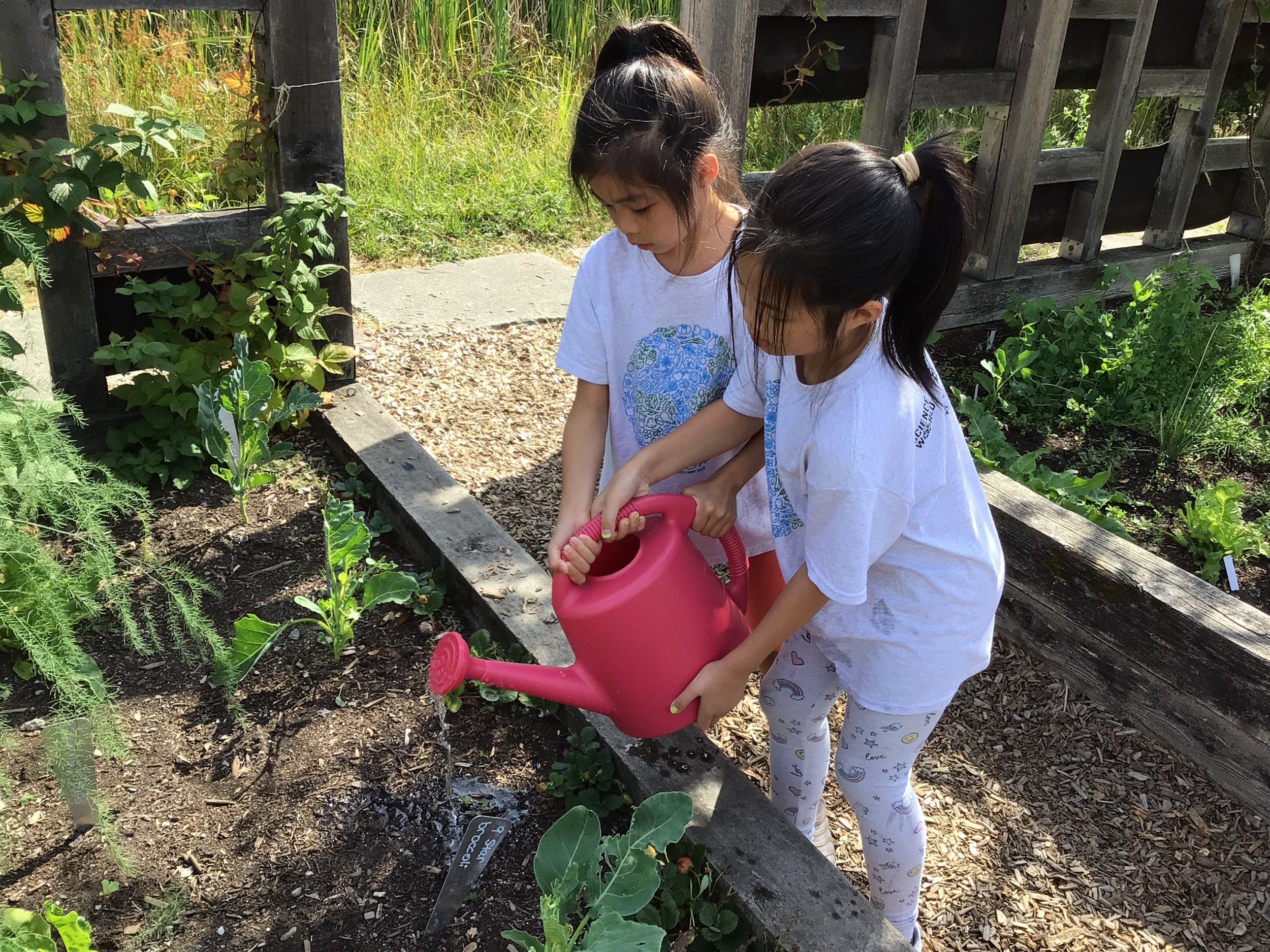
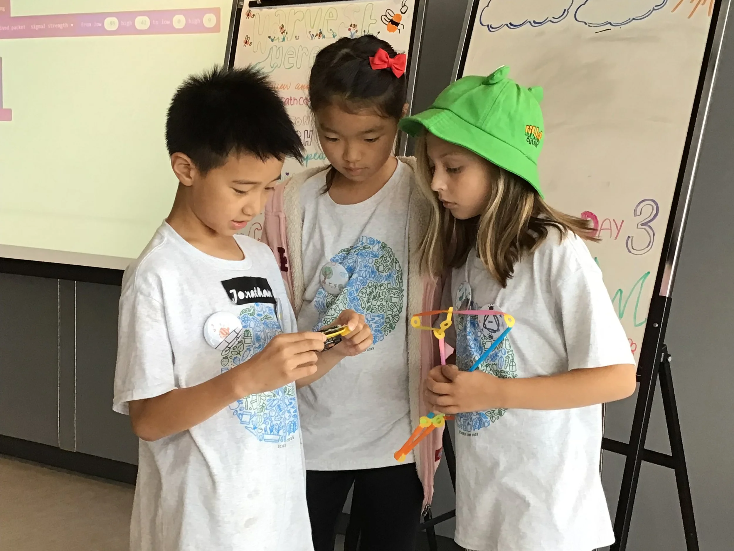
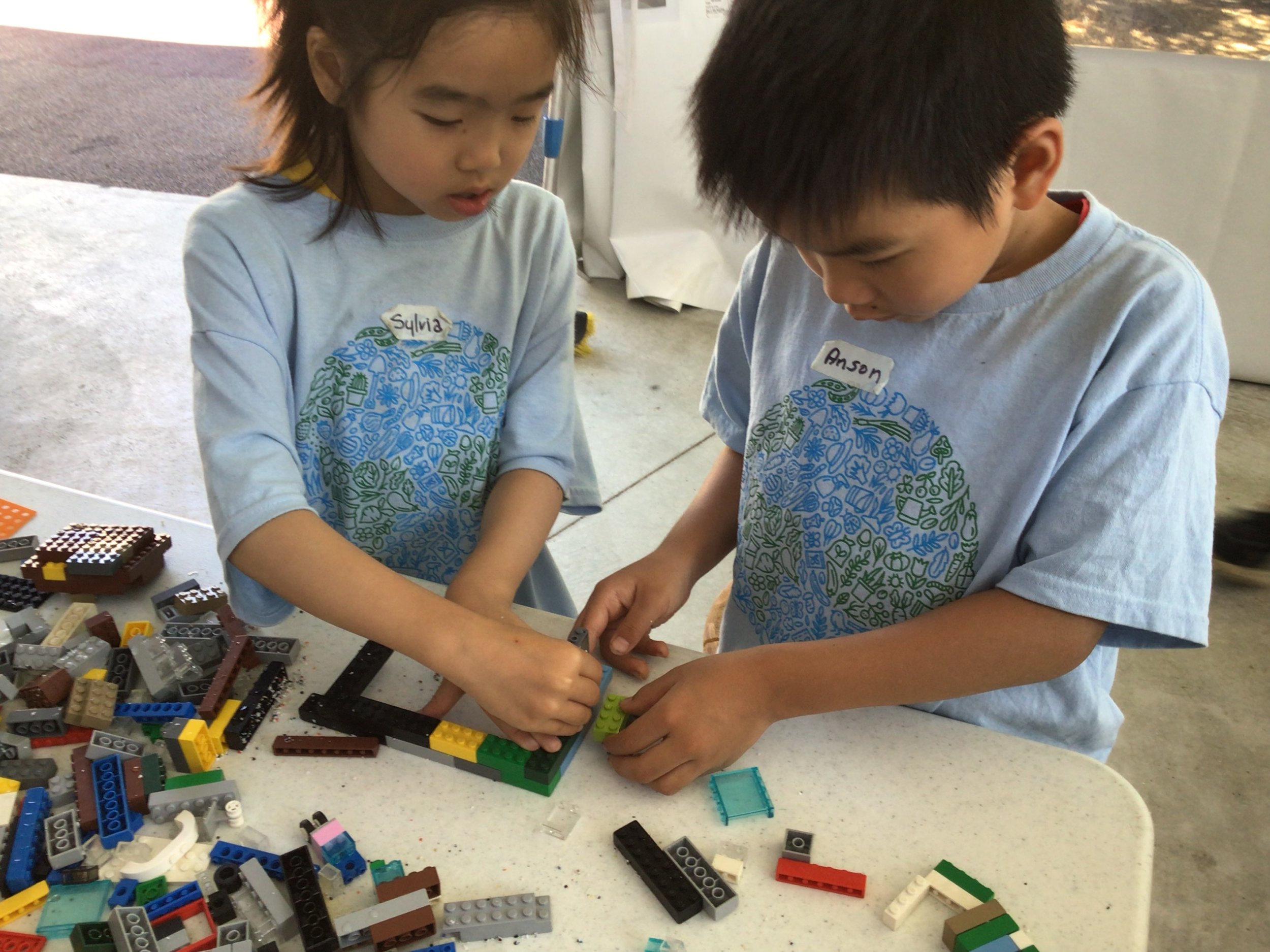
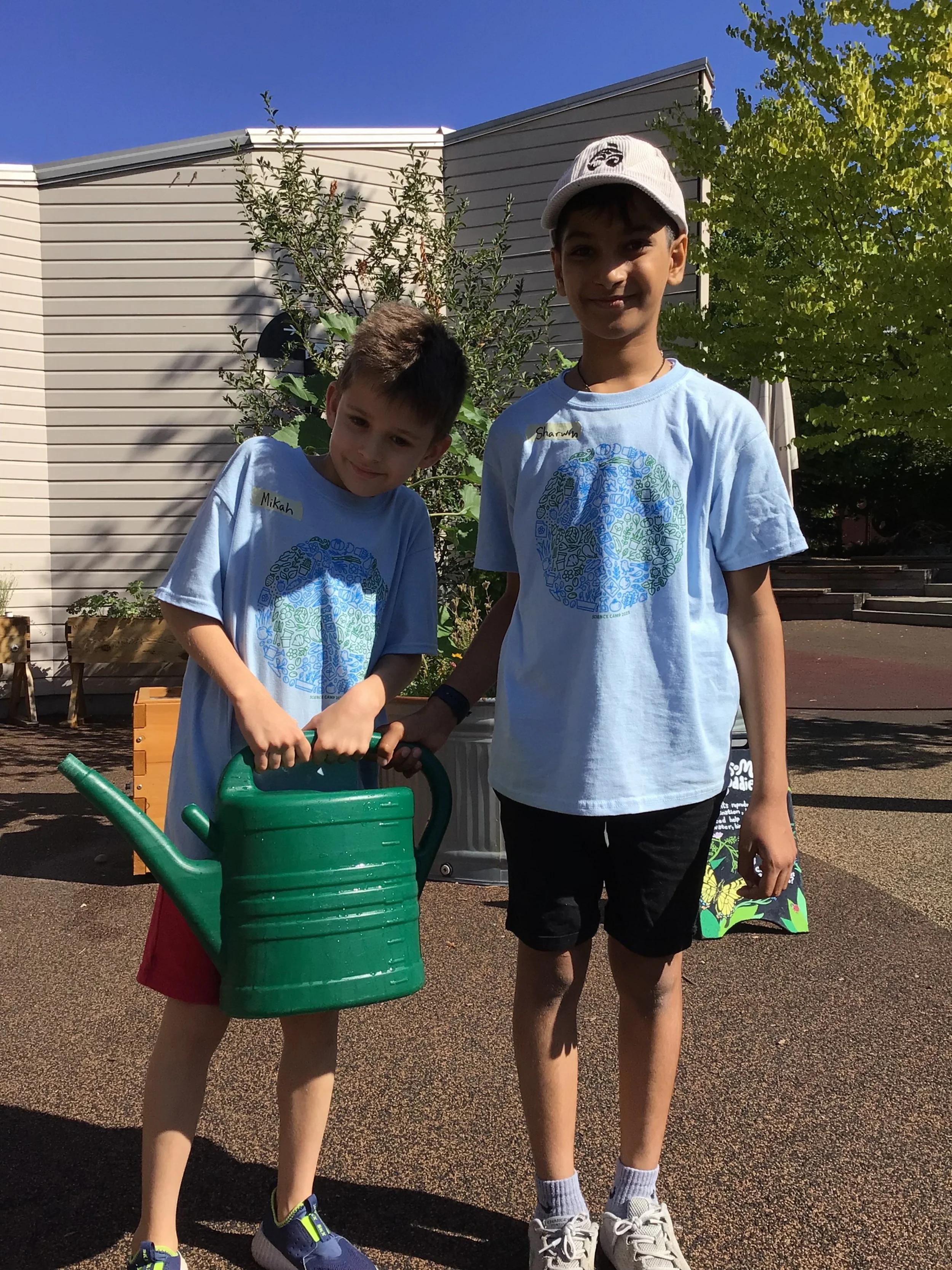
About: Science World’s Science Camp program is an annual 4-week sustainability-based summer camp for elementary school students.
The Project: Designing key artwork for the year’s camp theme based around sustainability. Apply the artwork to printed collateral, t-shirts, and digital.
Notes and initial sketch
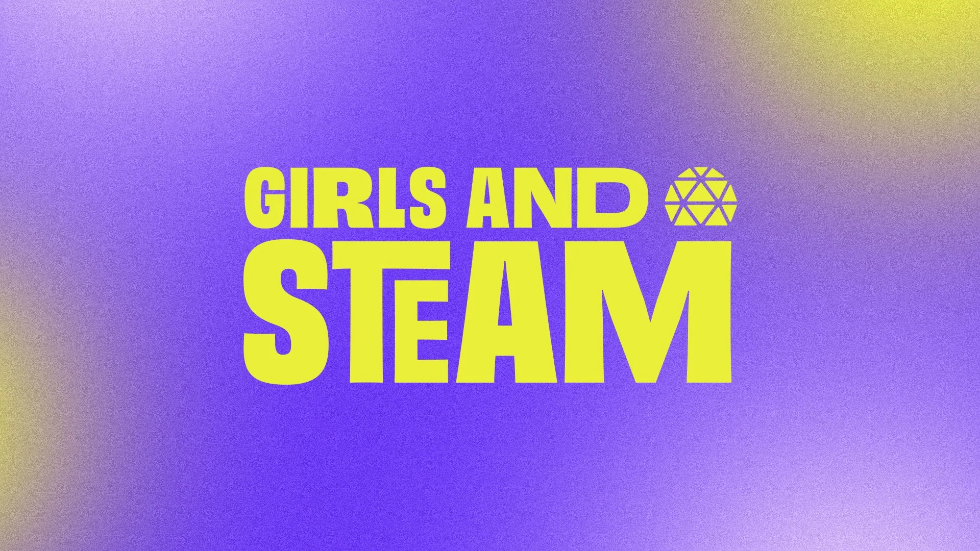
Brand refresh including logo, and visual system
Creative Director: Jen Cook
Event Photographer: This Is It Studios
Location: Vancouver, BC
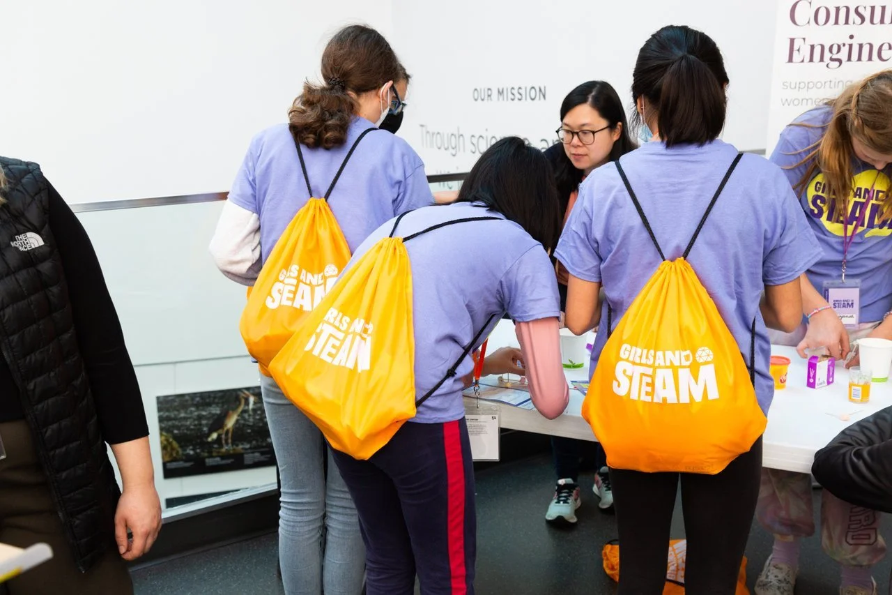
About: The Girls and STEAM program at Science World encourages young girls and women to pursue their scientific interests and explore careers in STEAM by giving them a welcoming space to expand their knowledge, engage in STEAM-based activities to increase their interest and confidence, and give them access to STEAM opportunities.
The Project: After a great 4 years of Girls and STEAM events, it was time for a brand refresh to reflect the evolution of the event as well as STEAM. With a slightly older audience (12-14 year-olds), this is a great opportunity to bring in some new energy and relevance.
The Goals:
• Reach new audiences; girls who have never attended yet—Entice them in
• Reflect all of STEAM and future-tech
• Build a system that is flexible enough to play around with and has some variety year-to-year
Collecting + Distilling
Started off with researching and collecting both visual and historical themes: women in STEM in history, current visual ideas. Followed up by a simple word dump of different adjectives that described some of the ideas that would arise. And finally, made connections and pulled out patterns between some of the things that were collected and put together 3 starting directions/concepts.
Ideation
With the core concept in mind, the search for fonts, logos, colours, and textures that may help express said concept was on. While keeping the concept mood board on a wall close by, we played around with logo ideas and got some iterations on the screen. We then move on to refining, refining, refining.
Asset Creation
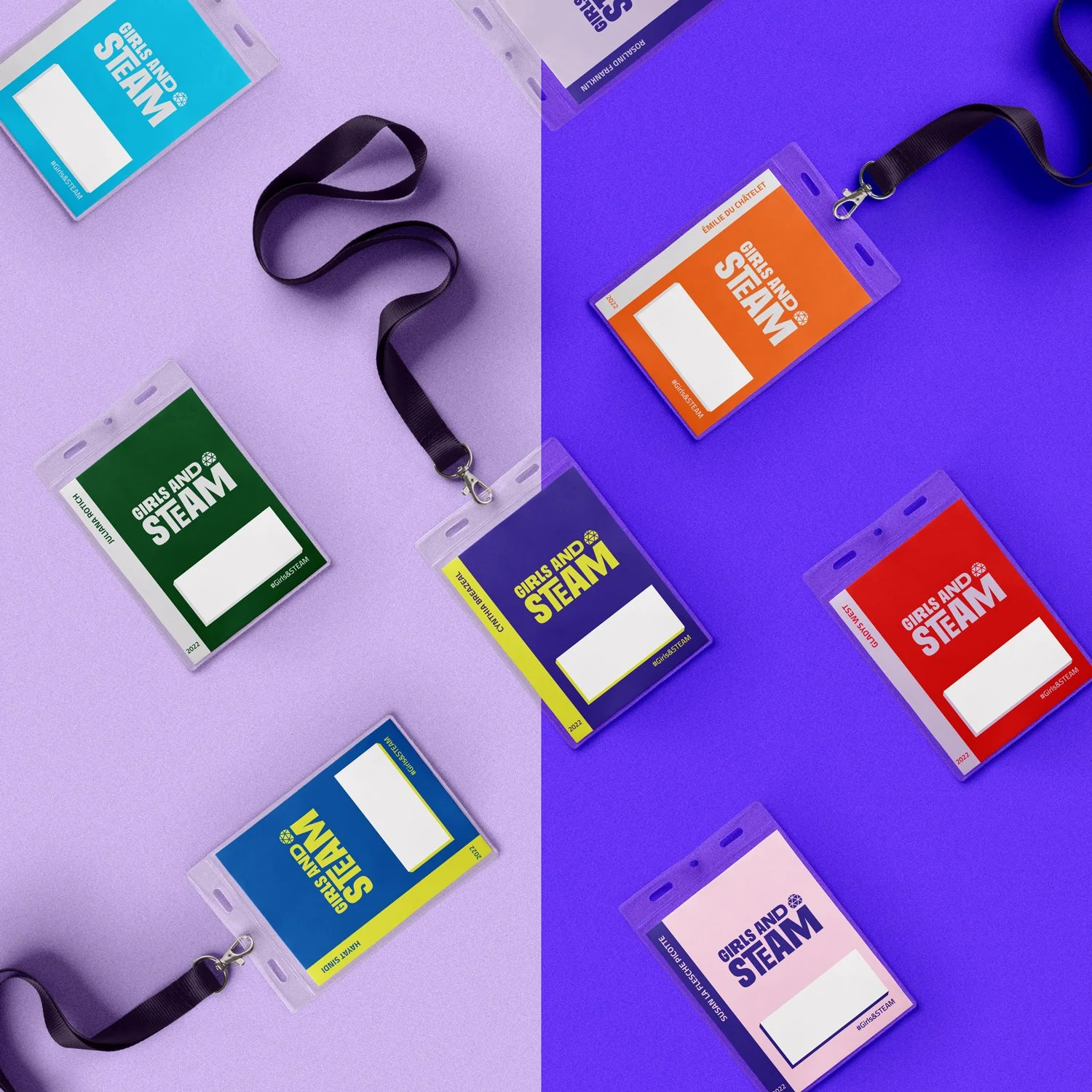
With the colour palette, main logo, and secondary logo finalized, we finish off designing the marketing collateral, applying the new colours/gradients and logos to different objects like t-shirts, ID inserts, social media posts, etc. ready for launch!
Girls and STEAM 2022 Summit. Photo by This Is It Studios
Logo iterations
Logo variations (coloured)
Girls and STEAM 2022 Summit. Branded cinch bags. Photo by This Is It Studios
Branded fillable ID cards
Stickers for participants
layout, print, lettering, large-format
TYPE: Contract Project YEAR: 2020
Science of Cocktails is Science World's signature event where all proceeds from the event support their Class Field Trip Bursary Program. This event brings Vancouver’s most talented bartenders and chefs to showcase the connection between ingredients, technique, and science.
In 5 years, Science of Cocktails has hit the milestone of raising over $1 million for their Bursary Program and wanted to share the happy news with all their guests for the 2020 event. The team wanted a big piece for the atrium wall so guests can take pictures with it, and read what they helped with so we decided to create two large pieces for the wall.
Adding the hand-lettered element, and using the brand colours and fonts for both pieces brought out the celebratory aspect, added that custom-made feel to entice people to read the content and interact with the pieces.